A normal distribution, a Z-score, and Shmoop walk into a classroom. The normal distribution and the Z-score say "ouch," while Shmoop gets to work on finding some probabilities.
Sample Problem
A dataset is normally distributed, with a mean of 177 and a standard deviation of 48. What is the probability of getting a result of 236 or greater?
We like looking at pictures. What good is a scavenger hunt if we don't know what we're supposed to find?
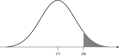
That shaded part under the curve will be the perfect spot for our picnic. It's also the same as the probability we are looking for. We can solve the problem and eat a peanut butter sandwich at the same time.
We don't like this distribution, though. It has too many ants on it. We'd rather have the same spot on a standard normal distribution. That means finding the Z-score at 236.
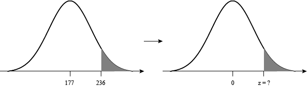
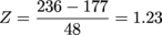
We can reword our question as, "What is the probability of getting a result greater than 1.23 standard deviations above the mean of a standard normal distribution?" Or, to put it in a real fancy, math-y way:
Pr(x > 1.23) = ?
We like this question a lot more, because someone else has already done the hardest work for us. We don't have to calculate the probability, we just have to track it down in a standard normal table. These things have hundreds of probabilities already calculated. The catch is that they can be a tad confusing to read at times. We'll walk through it nice and easy, don't worry.
Here is an example of a standard standard normal table. We highly suggest clicking that link and following along with us. Notice the picture in the upper-right corner: the probabilities in the table are those to the right of Z, or Pr(x > Z). That's exactly what we need, so no complaints from us.
To read the table, start on the left side and go down until you find the row next to "1.20." That's part of the Z-score we want to find. The other part is "0.03," and we can find that along the top part of the table.
| Z | 0.02 | 0.03 | 0.04 |
| 1.10 | 0.131357 | 0.129238 | 0.127143 |
| 1.20 | 0.111233 | 0.109349 | 0.107488 |
| 1.30 | 0.093418 | 0.091759 | 0.090123 |
We travel along the row "1.20" and down the column "0.03" until our fingers run into each other. Where they meet is Pr(Z > 1.23), and that equals 0.109349. That equals the shaded-in part of the graph we've been looking for. Now if only this table could help us find our keys.
Sample Problem
A dataset is normally distributed, with a mean of 342 and a standard deviation of 74. What is the probability of getting a result of 166 or greater?
Let's find the Z-score first, then we'll sketch what our probability looks like. Plugging into the Z-score formula we get:
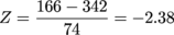
We put in our value first, then subtract the mean. Our result this time is a negative Z-score.
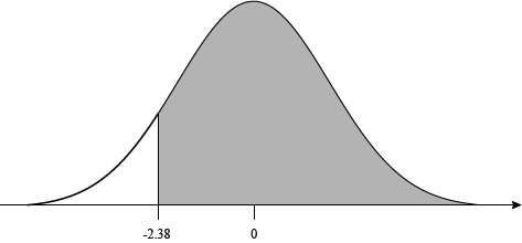
This looks like a problem. Our table only has positive values for Z. What a busted piece of junk, only giving us half of what we need. We'd demand a refund, but we found it for free.
All is not lost, though. Remember, the normal distribution is symmetric around the mean. The probability above positive Z will be equal to the probability below negative Z.
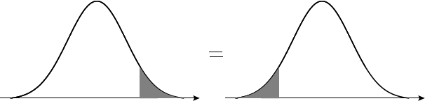
That means there's a connection between 2.38, the number in the table, and -2.38, the number we need. A math connection, not a love connection, though. It is:
Pr(x > 2.38) = Pr(x < -2.38)
Watch those greater than and less than signs. It is super easy to mix up what they mean. That's why we're drawing so many graphs; they'll never give us up or let us down.
The upshot here is that we don't have what we want yet. Using the standard normal table, we can find that Pr(x < -2.38) = Pr(x > 2.38) = 0.008656. That's the probability of getting a result below -2.38, but we want the probability above -2.38.
The final piece of this puzzle is the fact that the total area underneath the curve of a normal distribution equals 1. The total probability of an event has to add up to 1, so that makes sense. It's useful for us, because it means:
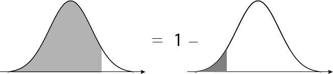
Setting up the problem we have:
Pr(x > -2.38) = 1 – Pr(x < -2.38)
= 1 – 0.008656
= 0.991344
And that's that. Our result matches what our first graph told us as well. Graphs: they stop us from making dumb mistakes.
Sample Problem
A dataset is normally distributed, with a mean of 70 and a standard deviation of 25. What is the probability of getting a result between 63 and 80?
How good of a juggler are you? Because now we have two points to handle at once, and we want the probability between the two of them.
We'll start by converting both of the points into Z-scores.
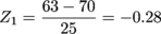

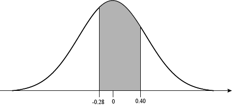
Pr(-0.28 < x < 0.40) = ?
We have an ice cream sandwich of a problem; we want to get at the good stuff in the middle. Our standard normal table only gives us the area to the right of each Z-score, but we can use a little subtraction wizardry to sort this out.
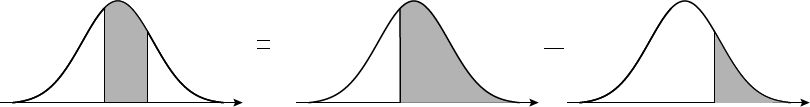
Finding everything to the right of -0.28 will give us everything we need and some stuff we don't. What would we do with an extra kitchen sink anyway? If we subtract out all of the area to the right of 0.40, that will get rid of all the excess. We guess we can use the sink to cart off all the excess once we're done.
Finding the area to the right of -0.28 is tricky, though, just like the last problem. Let's draw out the problem (in a good way) to solve this.
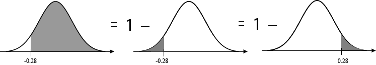
Now we have the problem in a table-friendly form. It'll always use a coaster for its drinks, and it won't stick its feet up on the table either.
Pr(x > -0.28) = 1 – Pr(x > 0.28)
Find Pr(x > 0.28) by going down the rows of the table to "0.20," then across until you hit column "0.08."
= 1 – 0.389739
= 0.610261
Hey hey, don't go and circle this as the answer. We want Pr(-0.28 < x < 0.40), so we still need to subtract out Pr(x > 0.40). At least the area above 0.40 is easy to find on the table.
Pr(-0.28 < x < 0.40) = Pr(x > -0.28) – Pr(x > 0.40)
= 0.610261 – 0.344578
= 0.265683
There we go, that's our answer. It's not quite as delicious as an ice cream sandwich, but still satisfying to have.
The More Things Change, The More They're Different
Here's one last word of warning for when we're finding probabilities with normal distributions. The table we gave you isn't the only kind out there. Instead of giving the probabilities to the right of the Z-scores, sometimes they'll give everything to the left. Or the area between 0 and Z. Even using a fancy graphing calculator won't save us from this confusion.
So, cut through all that nonsense by always drawing lots of little graphs. If we can see what we're looking for, and what the table gives us, then there will be no problem-o. Plus it lets us practice our unicorn doodles.