Histograms are another convenient way to display data. A histogram looks similar to a bar graph, but instead of plotting each individual data value on the x-axis (the horizontal one), a range of values is graphed. Histograms are useful when you have numerical data that varies quite a bit.
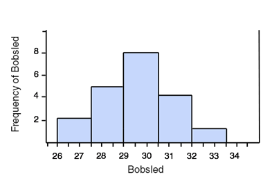
This is a histogram of the top 20 men's 2-man combined bobsled times for the 2010 Winter Olympics. Only the seconds are graphed since each time began with 3 minutes.

The times are marked on the x-axis, and the frequency (the number of teams who got each time) is graphed on the y-axis (the vertical one). By looking at the graph we can see that seven teams had a final time between 3:30 and 3:31 (3 minutes 31 seconds) and no teams had a time between 3:31 and 3:32.
This histogram has a "bin width" of 1 sec, meaning that the data is graphed in groups of 1 sec times. We could change the bin width to be larger or smaller. Here is the same data in a histogram with a bin width of 1.5 seconds:
The histogram doesn't display the individual times, nor are the times exact. However, it is a nice way to look at the trend of the data.