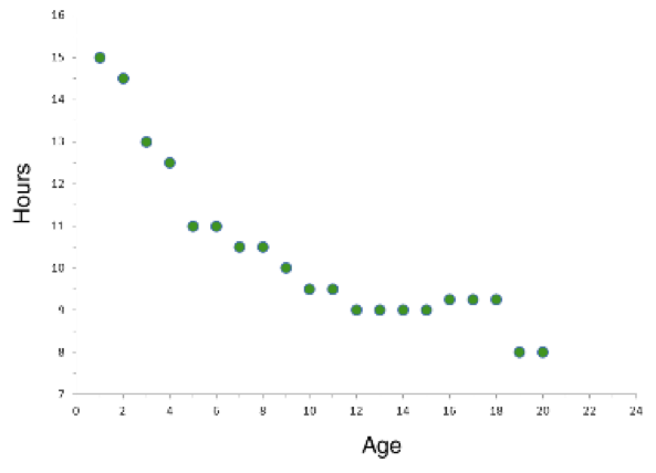
Example 1
This is a scatter plot showing the amount of sleep needed per day by age.
|
Example 2
These two scatter plots show the average income for adults based on the number of years of education completed (2006 data). 16 years of education means graduating from college. 21 years means landing a Ph.D.
What type of correlation does each graph represent? |


Example 3
What if females with 23 years of education have an average income of $80,000? How does including this point on the scatter plot change the trend of the line of best fit?
|
