ShmoopTube
Where Monty Python meets your 10th grade teacher.
Search Thousands of Shmoop Videos
Birth Year Predictions 257 Views
Share It!
Description:
ACT Science: Data Representation Passage Drill 3, Problem 2. After what year in the graph is the scientist's model most accurate at predicting birth year?
Transcript
- 00:03
Here’s your shmoop du jour, brought to you by birth predictions.
- 00:06
For example, we totally predicted that you'd be born.
- 00:09
Yeah, we called it.
- 00:11
After what year in the graph is the scientist's model most accurate at predicting birth year?
- 00:16
And here are the potential answers...
Full Transcript
- 00:20
Okay, so which graph is
- 00:22
hitting the nail on the head when it comes to birth year.
- 00:25
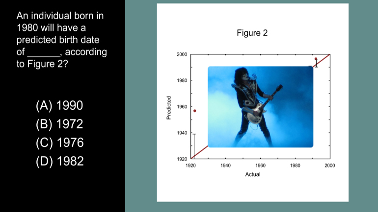
Figure 1 shows that the amount of carbon-14 (14C) in an individual's eye related to the
- 00:29
amount of 14C in the atmosphere at the time of that individual's birth.
- 00:33
That’s not the one we want at all.
- 00:35
So we should refer to figure 2, because the question is asking about predicting birth year.
- 00:40
Figure 2 just happens to be all about predictions.
- 00:43
The perfectly diagonal red line shows the ideal 1:1 ratio between the predicted and
- 00:47
actual years of birth. In other words, the dots would be on that red line if the scientists
- 00:53
were psychics and could predict the patients’ actual years of birth.
- 00:58
For this question, we’re interested in which red dots are closest to this red line.
- 01:03
After 1960, the dots seem to hug the line pretty closely,
- 01:07
but before 1960, they are relatively far away.
- 01:15
Guess the dots and the lines saw a couple’s therapist to work out their problems.
- 01:21
Since the dots are closest to the line only after 1960,
- 01:24
the model is most accurate at making predictions after 1960.
- 01:28
So our answer’s C.
Up Next
ACT Science: Research Summary Passage Drill 2, Problem 1. Why do you think that the filter paper will not remove the salt from the water?
Related Videos
ACT Science: Conflicting Viewpoint Passage Drill 1, Problem 1. What statement would both scientists agree upon?

ACT Science: Data Representation Passage Drill 1, Problem 1. What do the statistics in Figure 1 suggest?

ACT Science: Data Representation Passage Drill 1, Problem 2. Which of the following is a variable in Figure 1, but not in Figure 2?
ACT Science Data Representation Passage: Drill 3, Problem 5. According to Figure 2, what birth date will be predicted for an individual actual...